Updated January 2024
We are excited to announce a series of semi-technical data courses and two new data certification programs from Pragmatic Institute. Available in 2024, these courses are designed for data professionals aiming to sharpen their skills and beginners eager to break into the data science field.
Welcome to Pragmatic Data
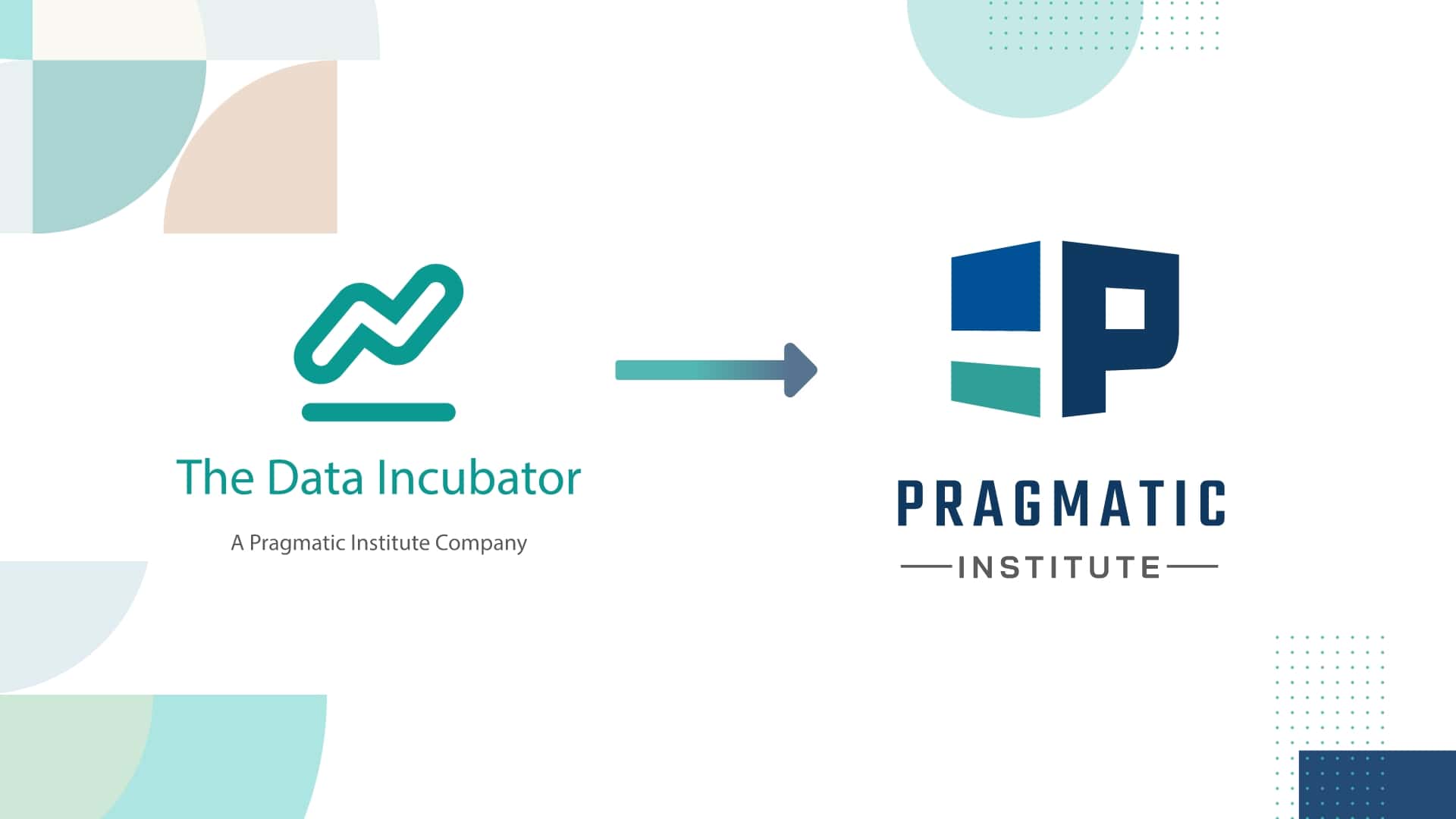
In 2019, The Data Incubator officially became a part of Pragmatic Institute, the authority on comprehensive product management, product marketing, and data science training. In 2024 and beyond, all data training will be offered by Pragmatic Institute.
What are the new data offerings?
Pragmatic Institute now offers adapted courses formerly offered by The Data Incubator. Current course topics include, but are not limited to, data wrangling, AI and machine learning, distributed computing, and advanced data storage architectures.
Explore Pragmatic Data Courses
How are Pragmatic Institute data trainings offered?
As of January 2024, all data courses will be offered as private team training. If you are interested in data training for your team, get in touch! We would love to connect with you.
What is Pragmatic Institute?
Founded in 1993 as Pragmatic Marketing, Pragmatic Institute has helped over 250,000 students from more than 10,000 companies across 26 countries and countless industries refine and perfect their corporate strategies. Featuring world-class instructors and trusted by leading companies around the world, Pragmatic Institute is proud to be a leader in data training.
Pragmatic Data: A New Division of Pragmatic Institute
While our name may be different, you will receive the same excellent hands-on data training you’ve come to expect from The Data Incubator. We’re still here to help you reach your career goals with guidance from Pragmatic Institute’s world-class instructors.
Does Pragmatic Institute offer data job placements?
At this time, Pragmatic Institute will not offer job placement services for students enrolled in our data training program.
I have questions – how can I learn more?
We have answers! Get in touch with our team.
Not finding the training you’re looking for?
As you explore Pragmatic Institute’s new data training offerings, you might find that our new courses do not offer the level of comprehensive data science or data engineering training that you’re looking for. Fortunately, there are some great options out there to help you in your educational pursuits:
Simplilearn has a list of 18 updated resources that are currently offering data science training.
Nobledesktop offers some free resources and online tutorials.
Coursera provides advice on how to choose a data science bootcamp.
And, Springboard offers courses and provides a list of data science-centered communities.